


J Engels
Staff Writer
jengels@umassd.edu
A roaring success with critics, Raya and the Last Dragon looks promising overall. Positive critical reception, however, does not excuse the fact that Disney, ever greedy corporation that they are, is getting away with charging subscribers of their streaming an additional just to watch it. Even if it did- even if I, personally, wasn’t morally against supporting this latest of Disney’s marketing schemes- such a disappointing dragon design in a movie where dragons are such a major part of the story is more than I can forgive.
In my experience as an illustration major who has spent over a decade of my life drawing dragons, what separates good dragon design and bad dragon design comes down to intention. While the beauty of dragons is that there aren’t exactly rules or limits as to how they can or can’t look, because dragons don’t exist in the real world it’s even more important when including one in a fictional context to consider what element of the fantastical they might be used to convey. To be fair to the concept artists behind Sisu, as some fellow illustration friends of mine have pointed out, it seems as though they had all the groundwork laid out for a perfectly good dragon. In the dragons of Southeast Asia- which the movie’s fictional country is based on- they had a rich source of inspiration to draw from. The Thai dragon that Sisu is likely based on, the Phaya Naga, is serpentine, made up of swirling, cloud like forms, and textures both invented and borrowed from the appendages of animals native to Southeast Asia (tigers,snakes,etc.). With these ornate mythological beasts as their guide, the designers behind Sisu produced a solid concept evocative of an ethereal, mythical underwater realm:
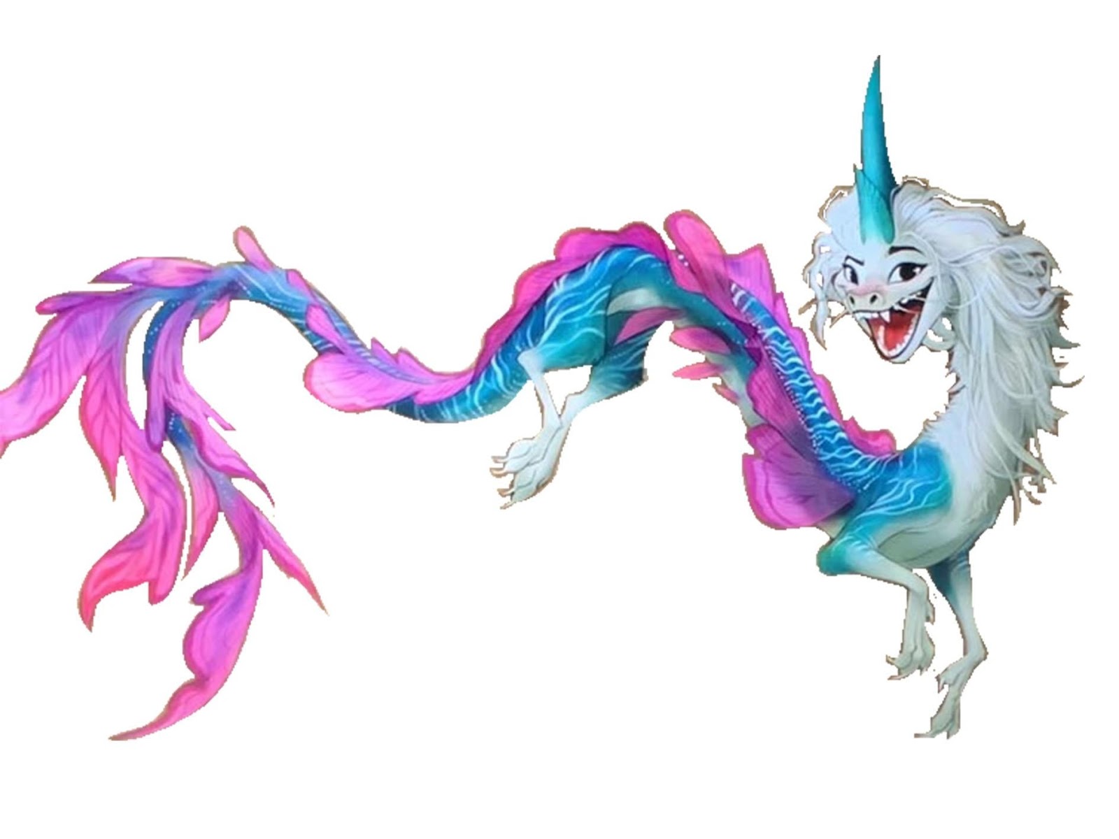
The problem with this design came when, almost certainly due to corporate meddling, the intention behind the dragon changed. This is Disney we’re talking about. I don’t need to watch this movie to know that regardless of what the final script for this movie ended up being, whatever intention the concept artists might have had in mind for Sisu’s design it was abandoned in favor of something more “marketable”. If you don’t believe me, just take a look at the tons of different toys of Sisu toys already available (a google search will bring them up) even though the movie has only been out for a couple of days. It’s no coincidence that Sisu has the same pastel blue color scheme, smoky eyelashes and smirking expression as Elsa; designed in the hyperfeminine image of one of Disney’s most popular characters, this is a dragon deliberately made for a certain audience. (Hint: it’s the same audience that the up-until- recently hyper feminine human characters were made to pander to.)
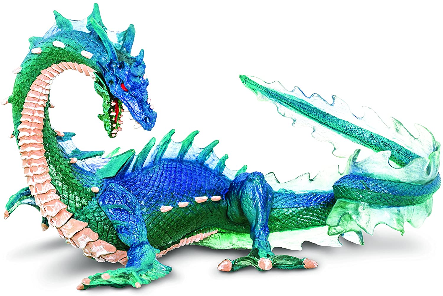
Valuing marketablilty over meaning when it comes to dragon design is not exclusive to Disney or even to movies in general- I’ve seen this exact scenario before when Safari LTD, a leading producer of dragon toys, reduced production of their usual fierce, elemental dragons to focus on a line of comically emotive dragons aimed at kids with a particular proclivity for the cute and cuddly. They went from making dragons that look like this:
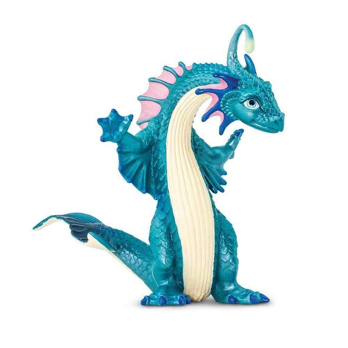
To a dragon that looks like THIS:
Whether it’s Sisu or dragon products in general, this obsession with making dragons commercially appealing in an overtly gendered way has simply got to stop- or I fear we may be heading towards a future where not even a creature as awe inspiring and innovative as a dragon generates any visual interest.
Just not sure sisu would’ve been as memorable or as strong of a character is they didn’t design her appearance the way they did. I can appreciate history and culture, but the majority of people watching Disney is kids (I’m 30 I love Disney) do you know kids would’ve liked sisu AS MUCH, or she would’ve been AS MEMORABLE, I’d they didn’t design her the way they did? Disney is notorious for changing and attempting progressiveness in society by changing roles such as the little mermaid. I am not blind to their antics, my point is, do you think children will understand the broad history or culture at such an early age ? The answer is no. The best they could do was implement the culture parts they did in order for users to understand this was in Asia. In my opinion the soundtrack caters to THE culture enough for me to understand this is no princess movie even though she is. Overall every princess is a warrior, for their heart, for their community or even for their own reasons that end up being humanitarian, anyway.
Maybe the femininity in the face is a little over the top but I liked the overall design in Raya and the Last Dragon tbh.
It’s a kids movie so I am sure they didn’t wanted to design the good dragons like they design their enemies with this scary face and quirks (Scar, Dschafar, Zira, Sarbor, Clayton and so on).